This is the 2nd post in a series, you may want to start from the beginning, this series includes:
- Easy form layout in WPF Part 1 – Introducing FormPanel
Easy form layout in WPF Part 2 – How to deal with more complicated scenarios (You are here).
Easy form layout in WPF Part 3 – Adding Groups.
You can find the complete source code with a sample project at the end of the last post.
In the previous post I’ve described the wonderful work saving FormPanel that can take care of the layout of simple forms, I said that it’s ok it only handles simple forms because this is the most common case and for the rest we can use normal WPF layout.
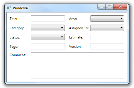
But we all know life just isn’t that simple and even simple forms always have to special controls, if we take the bug tracking example I used the first post then we probably have to add a comment field in there, the comment field must be both wider and higher than normal fields and give us a dialog like this:

What do we do now? stop using FormPanel? extend it to support every layout under the sun?
We just put it in a Grid, put all the simple controls in the FormPanel, put the irregular controls directly in the grid and use data binding to synchronize sizing between them (remember we defined LabelSize and ControlSize as dependency properties?)
And the XAML for this form becomes:
<Window x:Class="FormPanelApp.Window4"
    xmlns="http://schemas.microsoft.com/winfx/2006/xaml/presentation"
    xmlns:x="http://schemas.microsoft.com/winfx/2006/xaml"
    xmlns:l="clr-namespace:FormPanelApp"
    Title="Window4" Height="300" Width="500">
    <Grid Margin="10">
        <Grid.RowDefinitions>
            <RowDefinition Height="Auto"/>
            <RowDefinition Height="{Binding ElementName=FormPanel,Path=RowSpacing}"/>
            <RowDefinition Height="*"/>
        </Grid.RowDefinitions>
        <Grid.ColumnDefinitions>
            <ColumnDefinition Width="{Binding ElementName=FormPanel,Path=LabelSize.Width}"/>
            <ColumnDefinition Width="{Binding ElementName=FormPanel,Path=LabelControlSpacing}"/>
            <ColumnDefinition Width="*"/>
        </Grid.ColumnDefinitions>
        <l:FormPanel Grid.ColumnSpan="3" x:Name="FormPanel">
            <TextBlock Text="Title:"/>
            <TextBox/>
            <TextBlock Text="Area:"/>
            <ComboBox/>
            <TextBlock Text="Category:"/>
            <ComboBox/>
            <TextBlock Text="Assigned To:"/>
            <ComboBox/>
            <TextBlock Text="Status:"/>
            <ComboBox/>
            <TextBlock Text="Estimate:"/>
            <TextBox/>
            <TextBlock Text="Tags:"/>
            <TextBox/>
            <TextBlock Text="Version:"/>
            <TextBox/>
        </l:FormPanel>
        <TextBlock Text="Comment:" Grid.Row="2"/>
        <TextBox Grid.Row="2" Grid.Column="2" TextWrapping="Wrap"/>
    </Grid>
</Window>
Unfortunately this is not as simple as out previous example but we still saved a lot of typing, and if we want to add more normal controls – or rearrange them - we don’t have to change the grid definitions at all.
The form panel is extremely versatile for such a simple control – but it can’t do everything – for example what do you do if you want the labels above the controls?
Simple, just modify the panel’s MeasureOverride and ArrangeOverride to set the new positions – it’s unlikely you’ll intentionally use two (or more) layout styles in the same application so it’s much simpler to write a panel that’s a perfect fit for your specific layout than to write a panel that support every possible option.
And what to do if I want to separate controls into different groups? we will do this in the next and final post.
posted @ Tuesday, August 3, 2010 3:01 PM