New Here?
My name is Nir and I'm the founder of Nbd-Tech, this blog is about things that interest me, so you can find posts on productivity, running a software company and obscure technological topics.
If you like what you read you can
![[RSS]](../../../../Skins/NBD/Images/feed-icon-14x14.png) subscribe to the blog feed or
subscribe to the blog feed or
![[Twitter]](../../../../Skins/NBD/Images/twitterrific.png) follow me on twitter.
follow me on twitter.
 Standard unreleased version disclaimer: This post talks about unreleased version of yaTimer, my time tracker, things can change between now and the actual release (but I don’t expect them to change that much), yaTimer 2.5 will be a free upgrade for all existing customers.
I’ve always considered the reports to be on of yaTimer’s strong points, there are lot’s of them, they are designed to expose data that is actually useful, there are a lot of customization options and they look good enough to give to your clients.
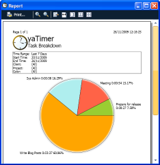
Except for the pie charts, The pie chart looks … let’s put it kindly – not up to the standard of modern charting tools – but with yaTimer 2.5 this has changed, the pie charts now looks good, they are colorful and have the subtle 3d and soft drop shadow they need to look professional.
Using the customize reports window you can choose to use the colors you defined for your tasks or, if you don’t use tasks colors, to let the system use a default color scheme, you can even get the old black and white charts back if you want (for example, if the colors don’t look good on your printer).
posted @ Friday, November 27, 2009 12:48 PM